馥域 An aroma place|水色設計
DECO TV
撰文者 - DECO TV 編輯部
資料暨圖片提供 - 水色設計
馥域 An aroma place
基地為角間獨棟建築一、二樓,面積加總約為 272 平方米,室內原有貫穿樓板的天井予以保留,並成為全案後續靈感發想的關鍵源頭。考量主建築三向臨路,設計時在一、二樓交界規劃白底金屬店招,右上角形似印章的店名字母透刻,隱約可見後方陽台綠色植物,階段式導引演繹外觀第一眼的純淨知性美。
The base is the first and second floors of a single-family building in the corner, with a total area of approximately 272 square meters. We preserved the original atrium that runs through the floor, which has become the master source of the follow-up inspiration for the whole case. Considering that the main building has three facing roads, we designed the junction of the first and second floors with a white metal storefront signboard. In the upper right corner, we made the letter of the shop name resembling a seal into a penetration of light engraving, and you can vaguely see the green plants on the rear balcony. Hope to gradually guide and interpret the pure and intellectual beauty of the appearance at first glance.
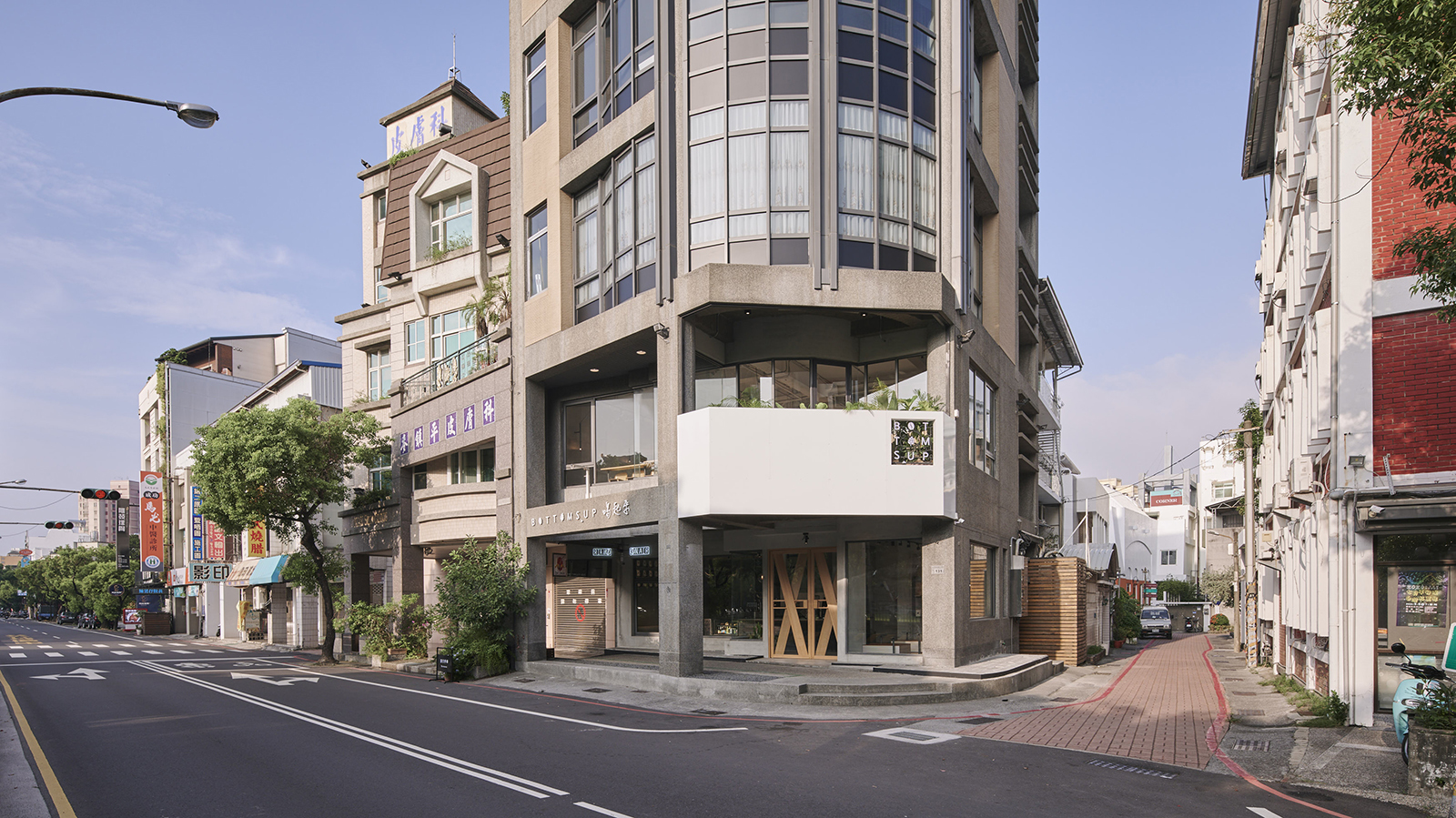
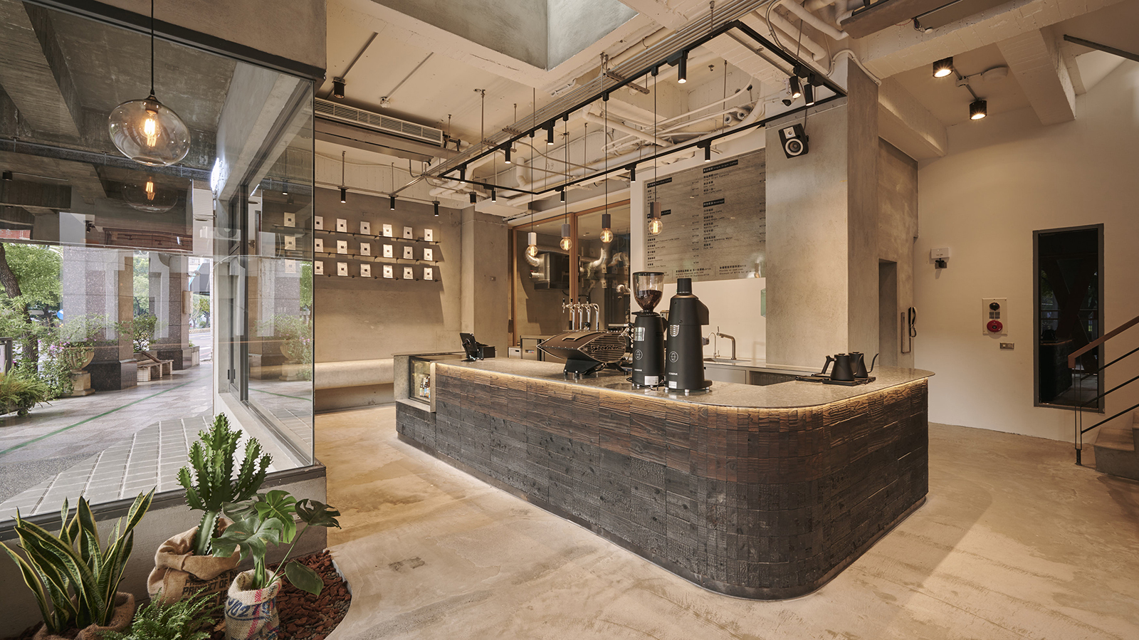
採咖啡廳、酒吧雙商業型態交互運營的一、二樓,大量玻璃施作的外立面順應騎樓內縮,帶出適當距離感,以及鬧中取靜的安謐氛圍,而由外而內蔓延的皮層灰階基底樸實親切,映襯木製大門的雙X圖騰、空間刻意裸露樑柱和管線、設備的現代輕工業風格,都讓室內、外若隱若現的動態光、影饒富趣味。
The first and second floors are the interactive operation of a double commercial type of café and bar. Conforming to the shrinking of the pedestrian arcade, we made numerous external glass facades to bring out an appropriate sense of distance and a quiet atmosphere. The grayscale base of the cortical layer spreading from the outside to the inside is plain and kind, the double X totem on the wooden door, the space deliberately exposed beams and columns, and the modern light industrial style of pipelines and equipment. All these make the looming dynamic light and shadow of indoor and outdoor fascinating.
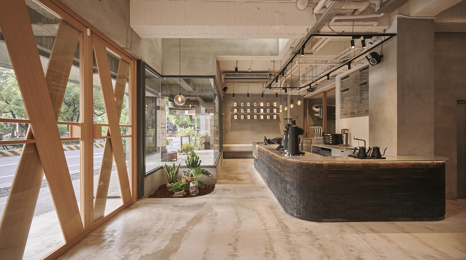
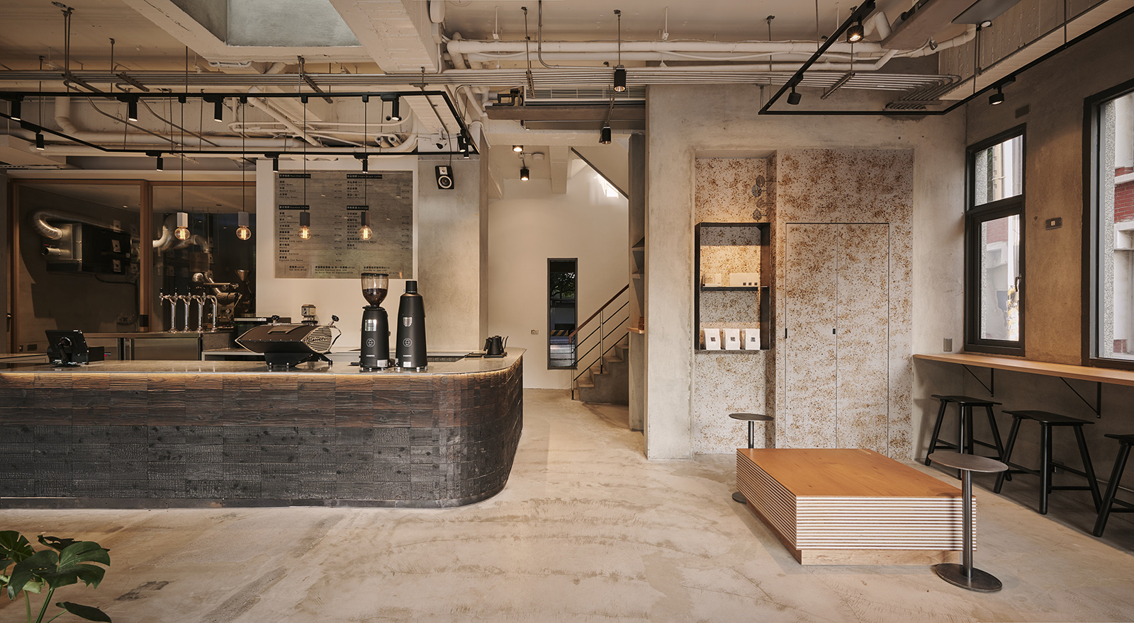
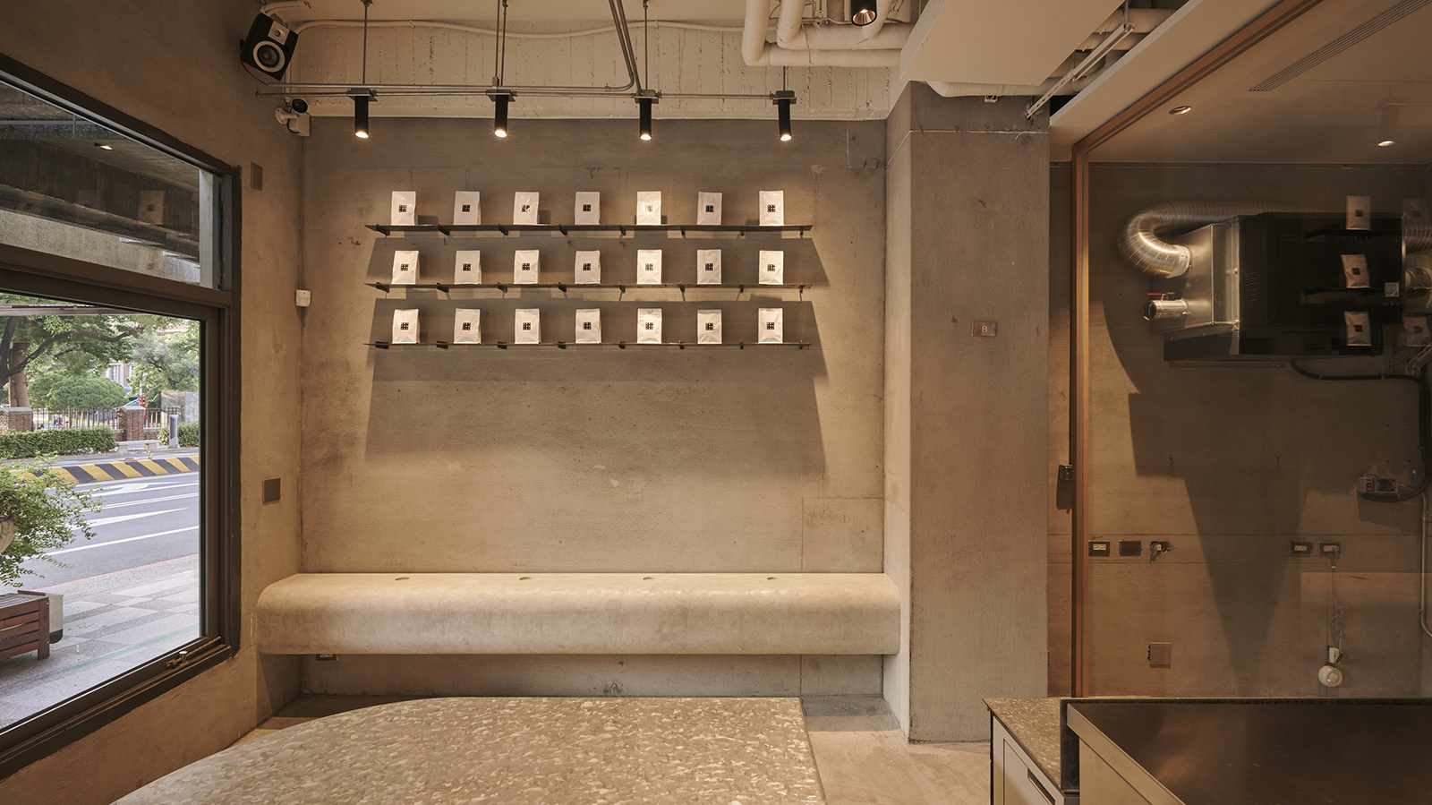
一進門,店主親手烘炒的馥郁咖啡香撲鼻而來。有鑒於空間對外皆是大面落地窗,光影聚焦效果已然足夠,反藉大門上雙X圖騰遮擋視線,同時透過門上開孔,為店內音樂和咖啡香氣,提供聽覺與嗅覺的誘惑路徑。一樓以置中工作吧檯為機能核心,量體外觀覆蓋燒衫實木,微帶光澤的煙燻質地,跟部分牆面取珪藻土、咖啡豆銀皮屑混合施作一樣,飽含溫暖疊加的時光味道。
The aroma of coffee baked and fried by the shopkeeper will come to your nose when you enter the door. Because of the large floor-to-ceiling windows outside the space, the light and shadow focusing effects are enough. Instead, the double x totem on the gate is to block the line of sight. At the same time, through the cutout on the door, we provide the temptation path of hearing and smell for the music and coffee aroma in the store. The first floor takes the central work bar as the functional core. We covered the measured appearance with burnt shirt solid wood. And its slightly shiny smoked texture is the same as that of some walls mixed with diatomaceous earth and coffee silver skin, which is full of warm and superimposed time flavors.
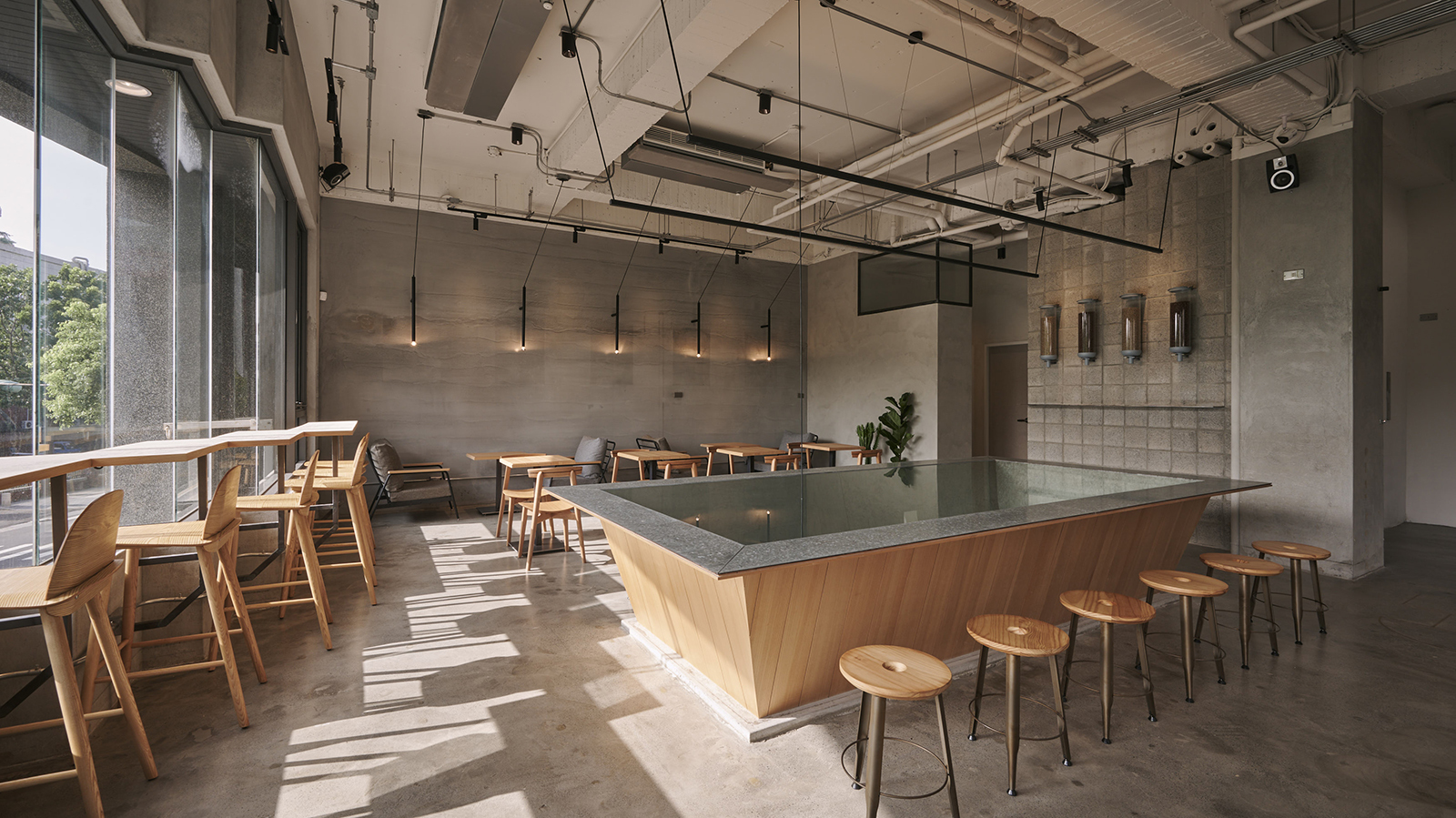
二樓全數規劃配合現場比例、來客組合量身訂製的各式客座區,中央處擔綱動線核心的玻璃長桌聚落,實際上是在加高斜梯型圍牆的天井口,覆以強化玻璃檯面而成,搭配檯面上特地作上投影、漫射的線型燈光設計,由此創造一道貫穿樓板的垂直景窗,即使互不交談,人與人之間的交流也從未停歇。
We planned all kinds of guest seating areas on the second floor that tailoring to match the on-site proportions and the combination of visitors. The long glass table settled in the center, which is the core of the moving line. We made of a reinforced glass surface on the atrium opening of the heightening inclined ladder wall. And the countertop is specially designed for the projection and diffusion of linear lighting. That creates a vertical view window that runs through the floor. Even if people don"t talk to each other, the communication between them never stops.
來源:《DECO TV》6 月
更多精彩內容請至 《DECO TV》
- 掌握全球財經資訊點我下載APP
- 講座
- 公告
下一篇