泠晰 The romantic and aesthetic house|沐易設計
DECO TV 2022-01-12 11:37
撰文者 - DECO 雜誌
資料暨圖片提供 - 沐易設計
泠晰 The romantic and aesthetic house
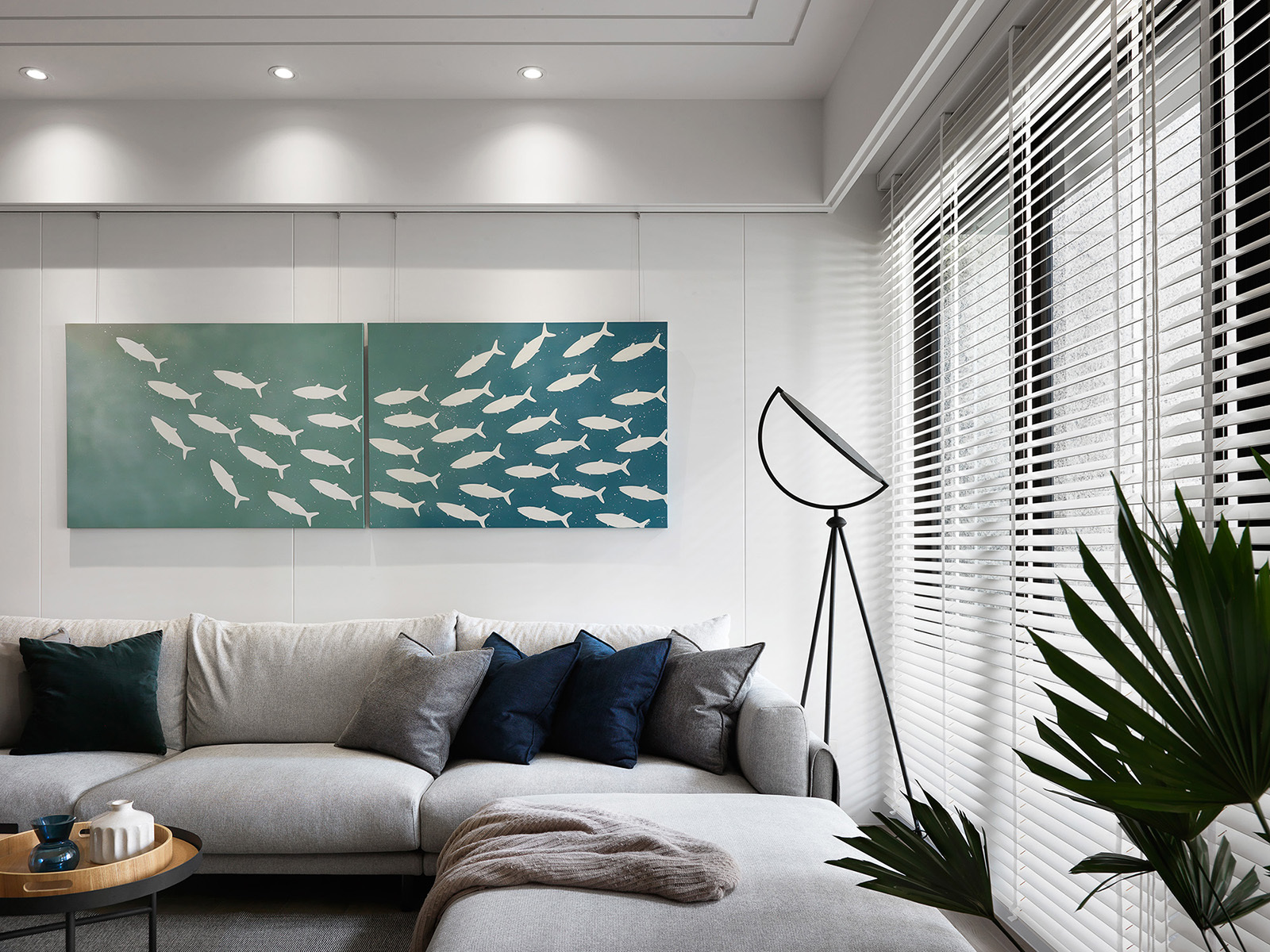
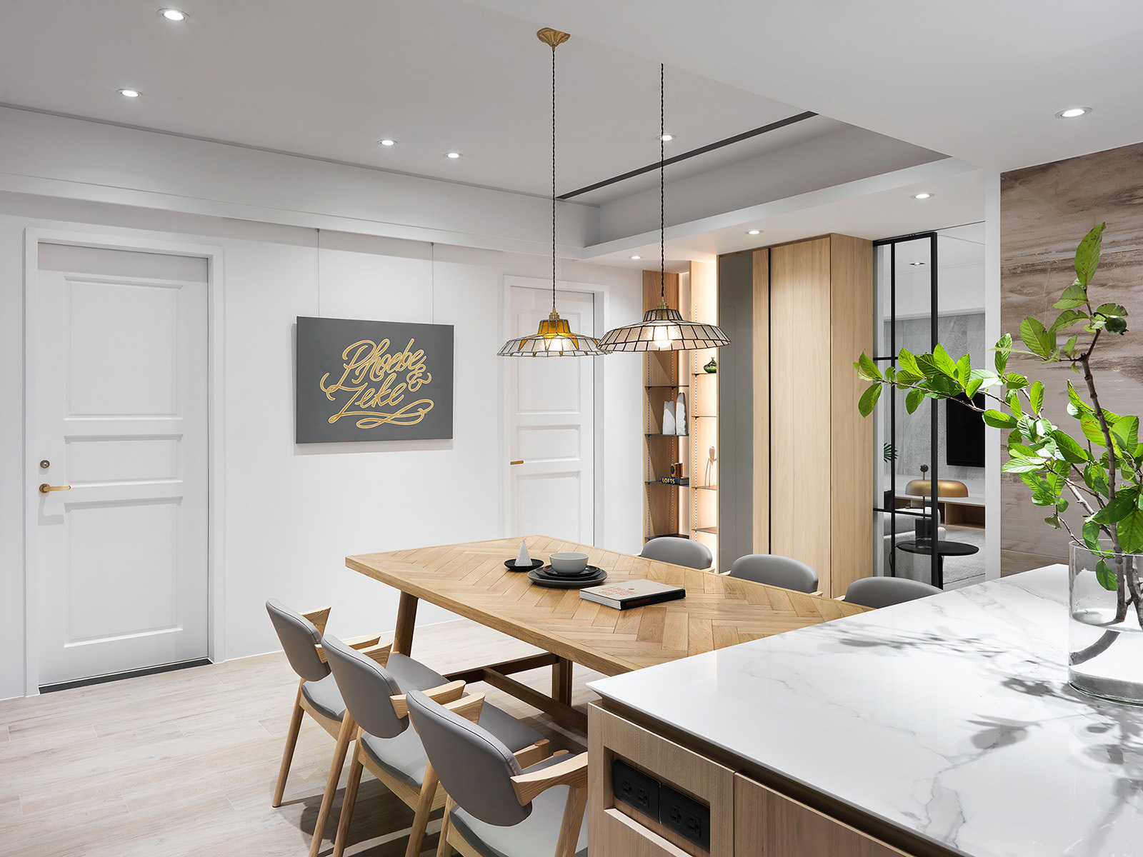
本案為單層住宅規劃,初期歸納使用者需求,囊括大量收納、乾淨明亮的空間基底,以及易於清理維護的造型面、硬體設計。其次有鑒於屋主夫妻是藝術家和科技菁英的組合,因此除了量身客製各項起居機能外,還須落實精準、精緻且不繁複的空間型廓。全案主要演色與設計靈感皆來自男主人親筆畫作、手工琉璃燈藝,例如客廳、餐廳作為端景懸掛的魚群、芋葉、英文簽名、餐桌吊燈等等,浪漫唯美畫風不僅夢幻色彩濃烈,也為三維向量的純粹錦上添花。
This case is single-story residential planning. In the beginning, we summed up the needs of users. It included that they asked for many clean and bright bases for space and modeling surfaces and hardware designs that are easy to clean and maintain. Secondly, the owners"husband and wife are a combination of artists and technological elites. Therefore, except for customizing various living functions, we had to implement an accurate, exquisite, and non-complex spatial profile. The primary color rendering and design inspiration of the whole case comes from the male owner"s paintings and hand-made glazed lamp art, such as fish, taro leaves, English signatures, table chandeliers hung as the vista in the living room and restaurant. That romantic and aesthetic style not only has rich dreamy color but also adds to the purity of a three-dimensional vector.

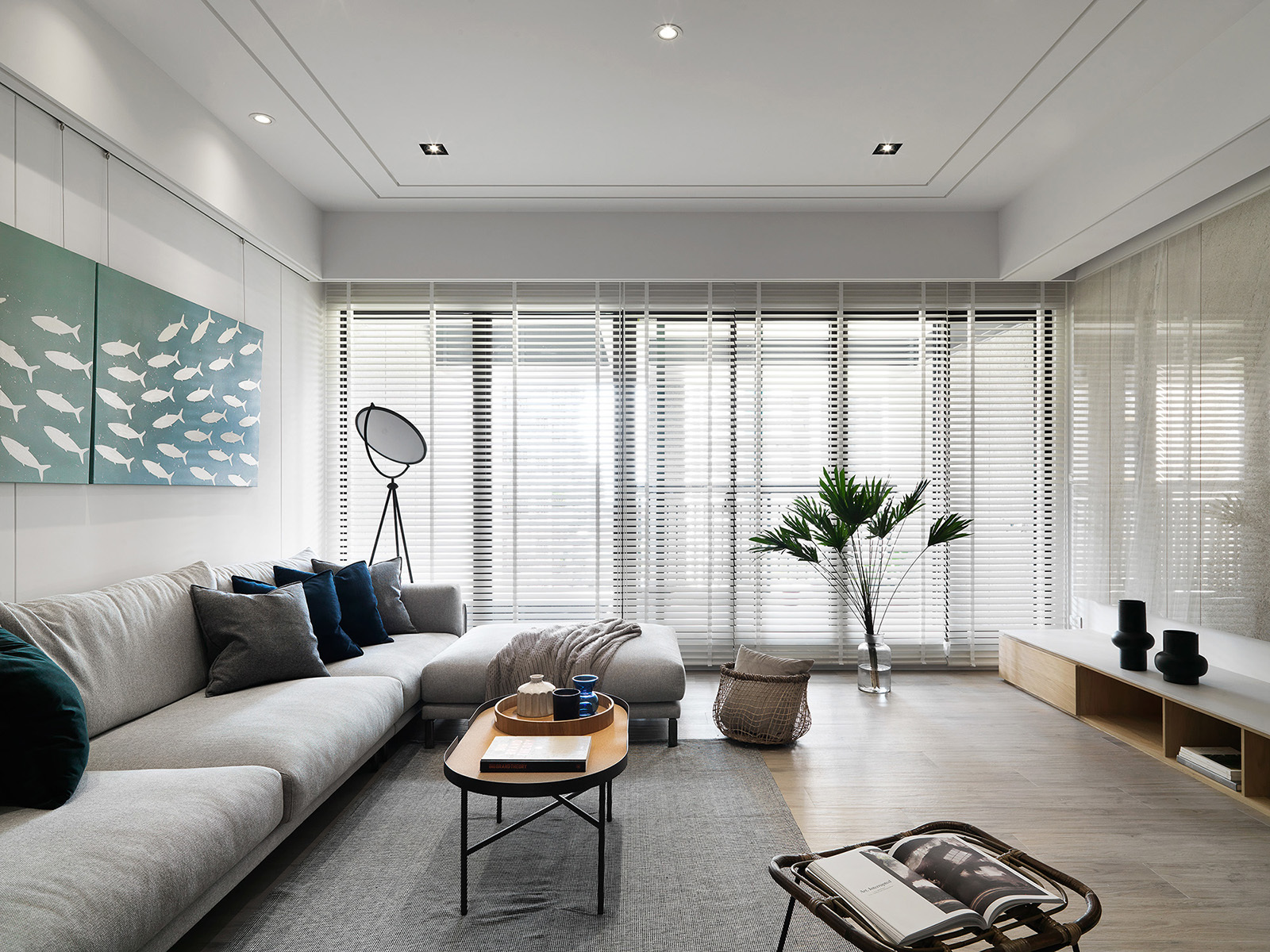
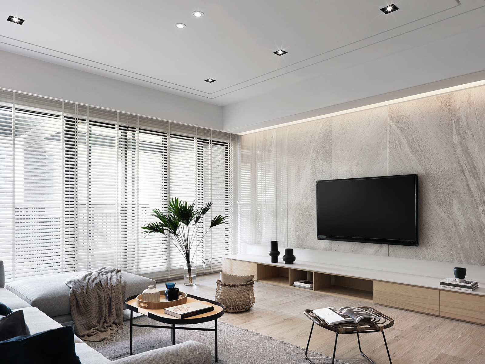
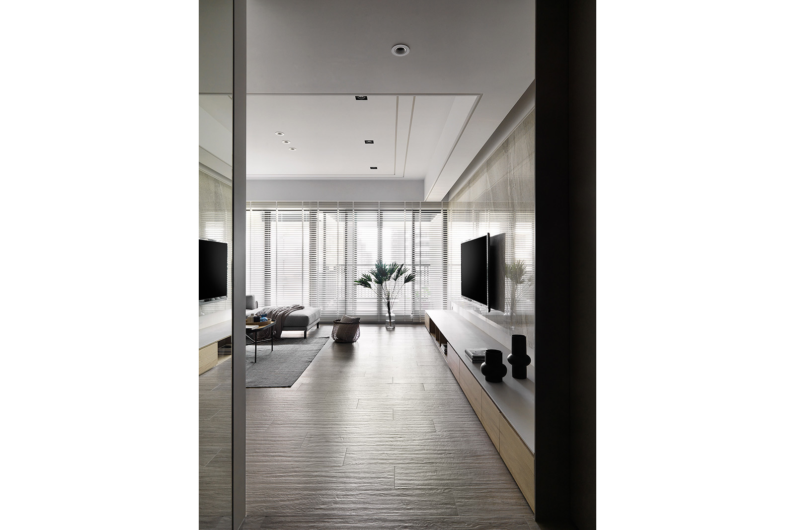
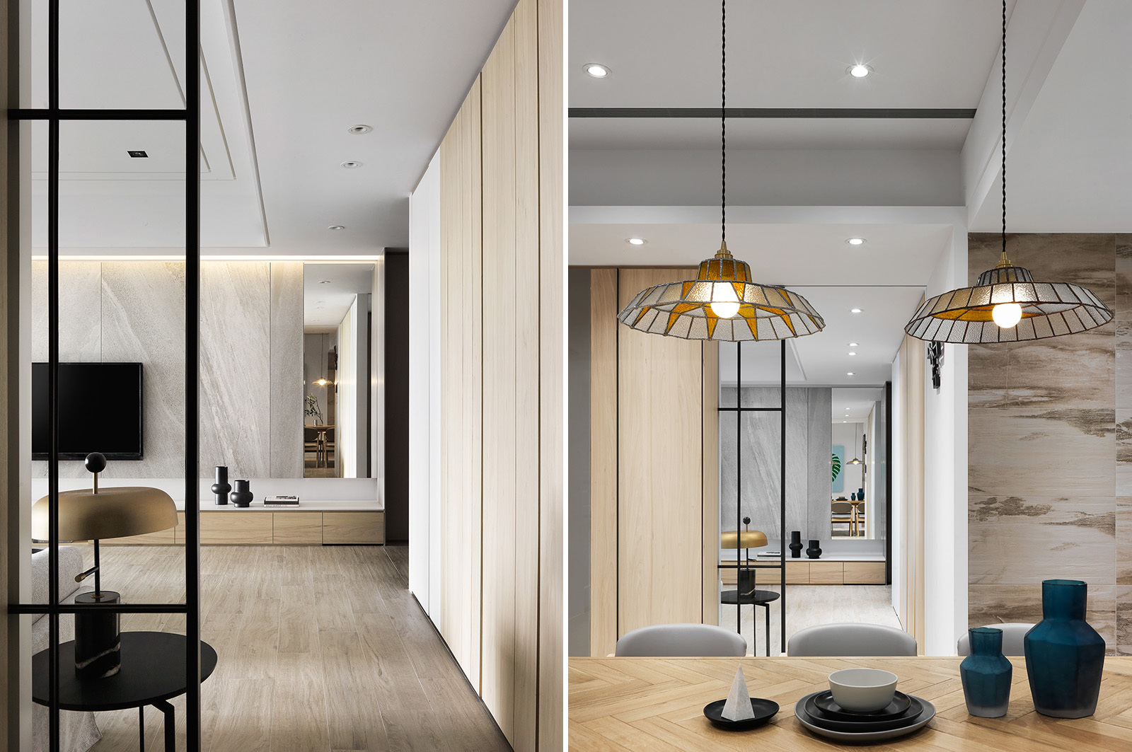
入口玄關兩側備有實用高櫃列,公領域地坪統一鋪設木紋磚,兼顧美觀、耐刮磨和好清理,並與客廳主牆的薄磚肌理靜謐呼應,區域內包含高櫃在內的造型面,大範圍選用柔白、淺木色調,僅以俐落直列線條傳遞律動感,客廳與餐廚之間運用一扇隱藏式拉門區隔,既不影響光影、視線穿透,關於生活的儀式性也更有層次。
We arranged practical high cabinets on both sides of the entryway. The floor of the public area was uniformly paved with wood blocks, where considering beauty, scratch resistance, and a good cleaning, and quietly echoes the thin brick texture of the main wall of the living room. For the modeling surface, including high cabinets in the area, we choose a soft white light wood tone in a great range and only use neat and straight lines to convey the sense of rhythm. We employed a hidden sliding door between the living room and the kitchen, which not only does not affect the penetration of light and shadow and line of sight but also has a higher level in the ritual of life.
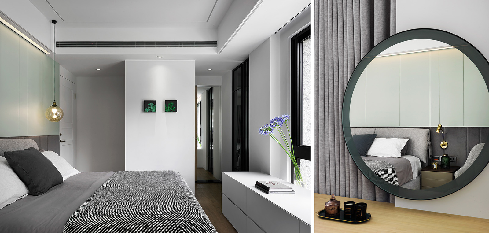
主臥室有壓樑問題,設計上捨棄制式包樑作法,在合理安排空調迴風路徑同時,順勢放大空間尺度,並根據男、女主人日常習慣差異,貼心打造床頭間照和兩側不對稱燈具。專屬更衣區兩段式設計,前端雙面櫃屏障進房視野,後段搭配黑色玻璃隔門分野,不僅四季衣物秩序井然,連帶滿足精品包、飾品收納和展示需求。
In the design, we discarded the standard method of wrapping beams was because the main bedroom had a beam pressure problem. While rationally arranging the air-conditioning return air path, enlarged the spatial scale. We also carefully created bedside indirect lighting and asymmetrical lamps on both sides according to the daily habits of the male and female hosts. The exclusive dressing area has a two-stage design, with double-sided cabinets at the front end as a barrier to entering the room and a black glass partition at the back end. It not only keeps the clothes of the four seasons in order but also meets the needs of boutique bags, jewelry storage, and display.
來源:《DECO TV》1 月
更多精彩內容請至 《DECO TV》
- 掌握全球財經資訊點我下載APP
上一篇
下一篇